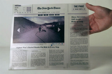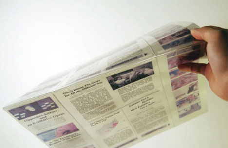
Designers have been all about the e-paper designs lately, and a major electronics company even unveiled a working prototype in early 2010. But so far, the designs haven’t centered on trying to maintain a familiar form. That’s where this concept from student designers Manny Darden, Jae Kim and Scott Liao differs from the others: it’s meant to call to mind the traditional look and feel of a newspaper. Its four-column layout does indeed look like one of those old-fashioned newspaper contraptions, but with some notable improvements: it’s weatherproof, the content is user-controlled, and it’s much thinner than a newspaper but with more information.
THE PAGE_Adaptive Delivery Device from Scott Liao on Vimeo.
The Page is an adaptive delivery device that makes carrying around large amounts of information much less cumbersome. The designers realized that there is something about newspapers that is intrinsically appealing to many people, something that can’t easily be replicated by electronic readers. They sought to keep that tactile appeal while adding to the possibilities and capabilities of the reader.

The reader’s layout looks like that of a traditional newspaper, but a few simple touches let the user control what content is seen on the page. Unlike most other e-reader concepts, The Page is foldable. This characteristic makes it simple to carry around in a pocket or bag, while its ability to store and display huge quantities of information makes it utterly convenient. There’s no information on how the team expects to fit the necessary memory and wi-fi abilities into a paper-thin device, but those are details – there’s plenty of time to work them out before this concept becomes a reality.

