If you’re like most consumers, you’ve probably seen a commercial or billboard for something and realized that you have no idea what product is being promoted. Complicated logos, trendy packaging, over-enthusiastic marketing plans, and slogans that make no sense at all can often obscure what it is we’re actually being prompted to buy. Wouldn’t it be nice to look at a product and immediately know what you’re going to get?

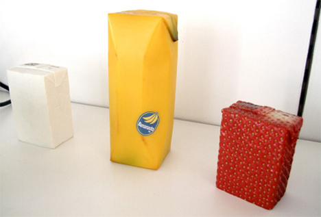
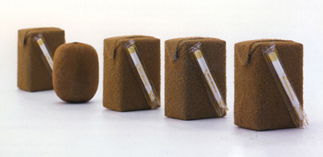
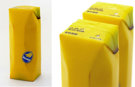
This fruit juice packaging concept from Naoto Fukasawa takes industrial design to a whole new level. What if product packaging accurately represented what was on the inside? Fukasawa’s intent was to create packaging that accurately represented the actual fruit’s skin in color and texture. He created banana, strawberry, kiwi and soymilk (which looks like a block of tofu) designs.

The actual production of packaging like this would likely be too costly to get these little guys on the supermarket shelves, but we think that other industrial designers could learn a lot from the public response to this packaging. After appearing at a 2008 arts and design show in Scotland, the fruit juice packages have received enthusiastic praise from around the world. Maybe we’re ready for packing that brings us a little closer to the product we’re consuming.

