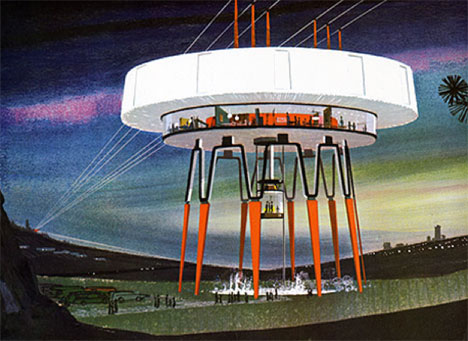
Power stations and transmission towers have never been the most appealing structures, but in the 1960s United States Steel had the inclination to change that. The company commissioned Henry Dreyfuss and Associates to create alternative designs for future power stations, and these futuristic concepts were the result.
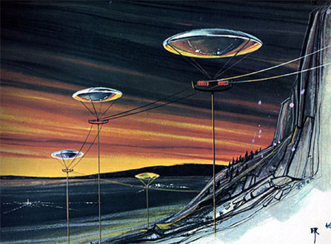
Far removed from the plain, industrial, rather ugly power stations we all know and mostly despise, these concepts are sleek and lovely. They share many of the same sensibilities applied to other future-living concepts of the mid-to-late 1960s, with some of the buildings looking far more like UFOs than power stations.
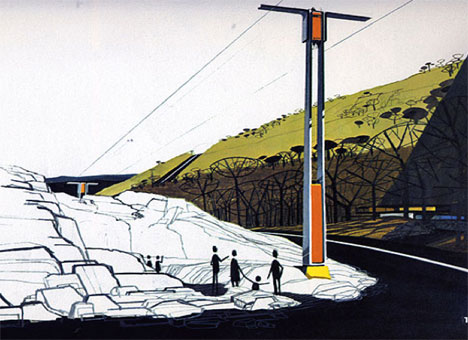
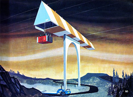
The book is called Power Styling, but it’s not quite clear just who was responsible for the illustrations. Grain Edit confirmed that it wasn’t the work of Syd Mead – the artist behind the distinctive looks of Blade Runner and TRON – but it’s not clear who did create this classic corporate art.
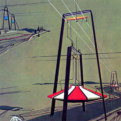
The designs in Power Styling were meant to bolster public acceptance and approval of power stations and transmission lines. Although they are necessary for our modern lifestyle, no one wants to have to live near them or even see them. These “modern” designs would have offered a slightly more stylish landscape.
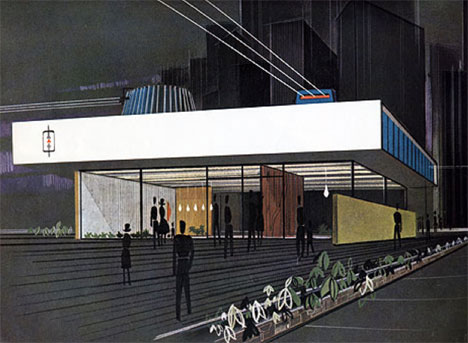
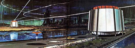
Who knows why these designs were never put into practice? Maybe they were too far ahead of their time, or maybe the people in charge of actually designing power stations realized that people are going to hate the structures no matter what they look like and realized that it was best to keep them simple.

