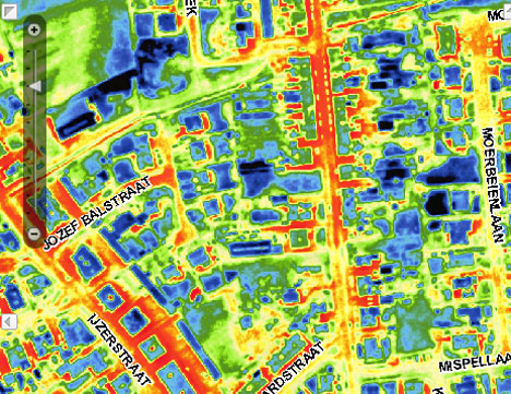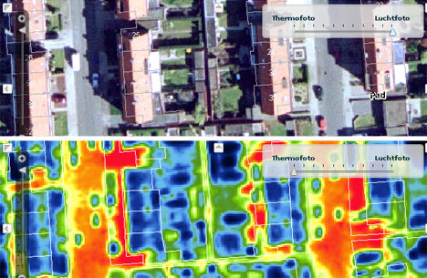
By now, most of us have played with Google Maps to find aerial images of our homes and offices, but residents of Antwerp, Belgium have an even cooler way to look down on their dwellings. This website gives homeowners an infrared look at their homes and just how much heat is escaping through their insulation. The infrared images, captured from a small airplane, give visitors to the site a basic kind of heat vision: red and yellow indicate areas of more heat while green and blue areas are cooler.

The images used to create the heat-indicating map were all taken over the course of four cold nights in March 2009; they were overlaid on regular photographic images the neighborhoods. The website is the cooperative effort of 21 municipalities in Antwerp; the hope is that homeowners will be inspired to improve their home’s energy efficiency. It’s one thing to tell homeowners that they should improve their home’s insulation, but letting them see first-hand how much heat is escaping and being wasted might spur them to actually make a change. Besides, looking at your neighborhood with infrared vision might be just about the coolest way to see the place you live.

