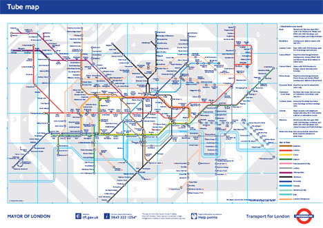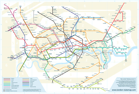
Anyone who has lived in or visited England has no doubt seen the iconic Tube map. The simple, colorful design (above) is not so much a map as it is a diagram of the Underground stations and their relative positions. While it’s been an effective way to find your way around London since the 1930s, designer Mark Noad says it’s time to move on to a more geographically accurate representation of London’s underground train system.

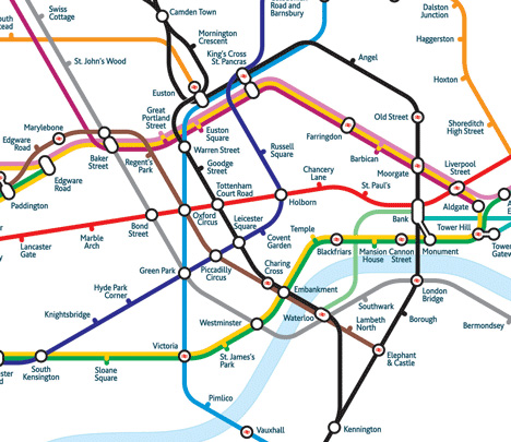
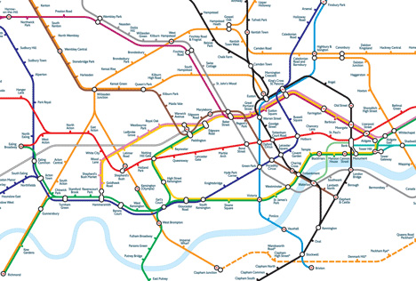
Noad’s map, above, keeps the easily understandable colors delineating each train line but makes it possible to judge geographical distances between each station. Most Londoners will say there’s nothing wrong with the old map and that it wasn’t designed to be a map for those traveling on foot. But the new map would be reassuring for tourists who find the traditional map over-simplified to the point of being confusing.

Noad’s new design turns a designer’s eye to the problem, using a more space-efficient font that is easy to read on printed materials and on mobile devices. The geographically accurate diagrams indicate, even to first-time London visitors, just how far apart any two stations are. The design truly does seem to be geared toward the non-native Londoner, giving a simple way for the tourist to tell whether she should use the station on this block or whether she can safely keep sight-seeing for a few more blocks without wandering too far from the Tube. The map can help those traveling via overground trains as well because it shows where they link up with the Underground.

The redesigned map will come with a huge benefit: an interactive website that will eventually feature layers of information. The layers will all contain different tidbits such as walking shortcuts, times between stations, zones and disabled access. Noad’s design is far from becoming the official Underground map, but it’s already gained a following of enthusiastic fans. For those who truly don’t see the merits of the new design or who simply don’t like change, the official Underground map is still being promoted by Transport for London as a simple and clear guide to the below-ground trains of the capital. In the end, it seems to come down to a matter of taste; one map doesn’t necessarily fit all users.

