The barcode has revolutionized the way we shop. Rather than having to enter a code for each and every item we buy, cashiers have only to scrape the black and white bars over their little red lights and the item is immediately scanned into their system. Scanning items in this way saves the grocery and retail industries billions of dollars each year, but – to be frank – there’s not much to get excited about where barcodes are concerned.

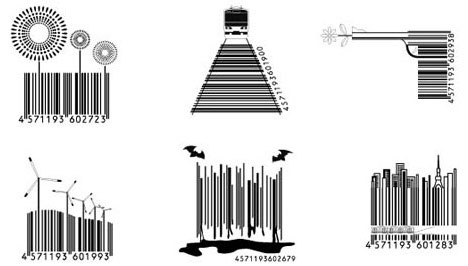
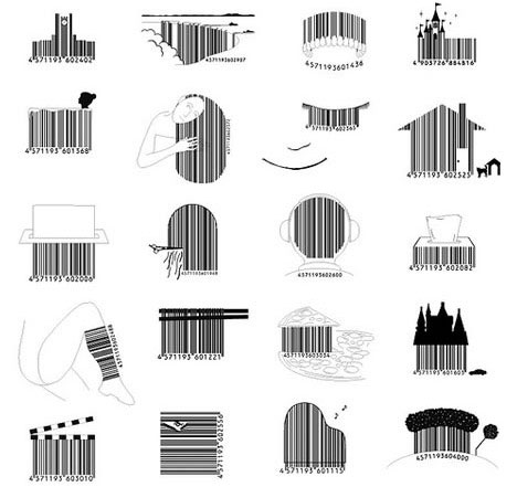
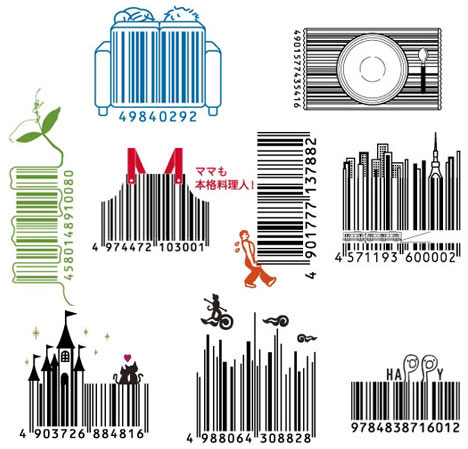
There’s really no reason that barcodes have to be boring and plain. As long as the lines can be scanned normally, there’s actually a great deal of artistic freedom to be had with the designs. Japanese design firm D-Barcode is grabbing onto that freedom and making all kinds of inventively artistic barcodes.

Some of their designs feature the black and white lines being formed into fun shapes; others integrate extra design elements like buildings, flowers or words “growing” out of the lines. Little 3D elements even creep into some of the designs, as do a few basic colors, showing that there’s absolutely no reason for barcodes to be boring. When done well, they can even become part of the product packaging itself.


