
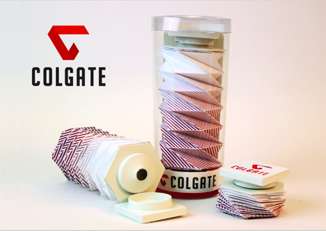
Design student Nicole Panuzzo created a redesign of the Colgate logo and packaging, giving both a wildly different look. Taking her inspiration from Colgate’s iconic red ribbon, a clean tooth, and a sparkling, eternal diamond, she came up with the above red ribbon-like logo.
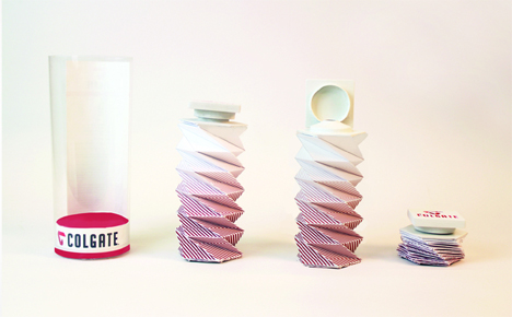
The packaging design, however, is a huge departure from Colgate’s current and traditional packaging. Replacing the plastic tube crimped on one end, Panuzzo’s design is a collapsible tube that gets shorter over time as the product is squeezed out, ensuring that nothing goes to waste.
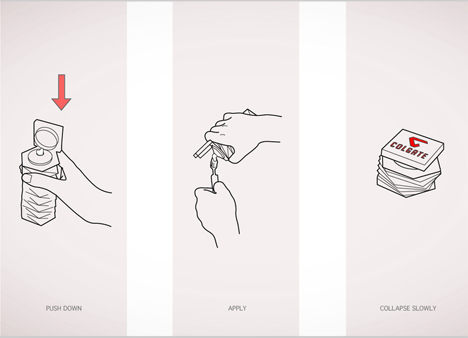
The accordion-like package compresses as the product is pushed out, getting smaller and smaller. Its shape ensures that every little bit of toothpaste makes its way up and through the top – as long as you remember to push from the bottom and not squeeze from the middle.
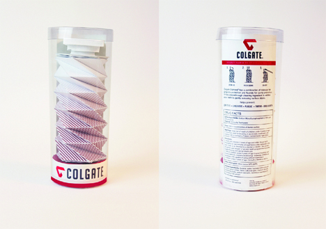
Although the design is unconventional, this design student has the right idea when it comes to rebranding. The 300-year-old company would certainly stand out with this modernized version of its packaging. Panuzzo doesn’t go into details about how eco-friendly it is (probably not very since it comes encased in a plastic tube), but if the collapsible tube could be made of renewable, recyclable materials it would be a win both for Colgate and for the planet.